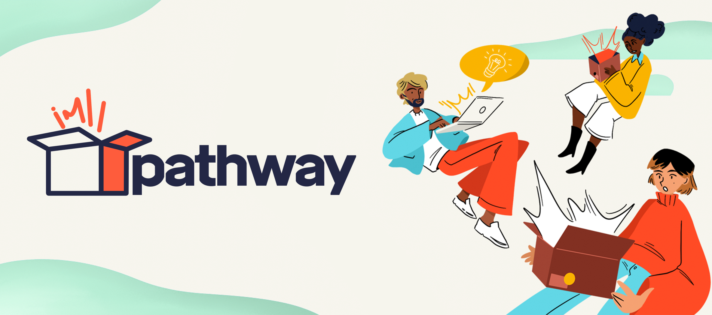
PATHWAY BRANDING
An unlaunched experimental project I did for the crowdfunding platform Indiegogo.
The goal was to create an identity that was different from the Indiegogo branding while still consisting of elements that showcased who Indiegogo was as a company.
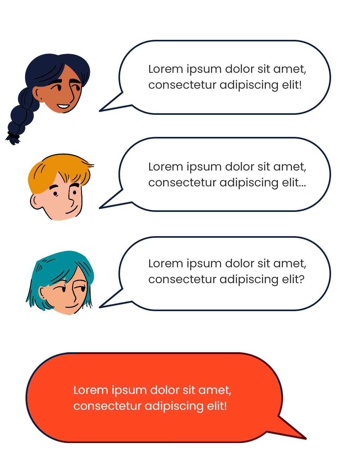
I wanted to make sure this project helped users feel energized and excited about this part of the process, so I featured bright color palettes and dynamic visuals to help celebrate how far they had come in their product launch journey. The character design is friendly and approachable to lend a sense of helpful hand-holding - the user should feel like they’re not working at this alone.
While I can’t give away details of the project listed or reveal text, please contact me if you’d like to hear more about my ideation process!

LOGO EXPLORATION
Indiegogo already had a font they wanted to go with (top left →). With that in mind, I came up with different iterations of a logo.
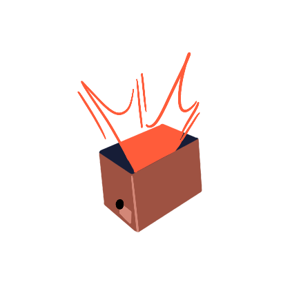
I stuck with the original box idea and updated it with movement in order to reflect a customer’s excitement.
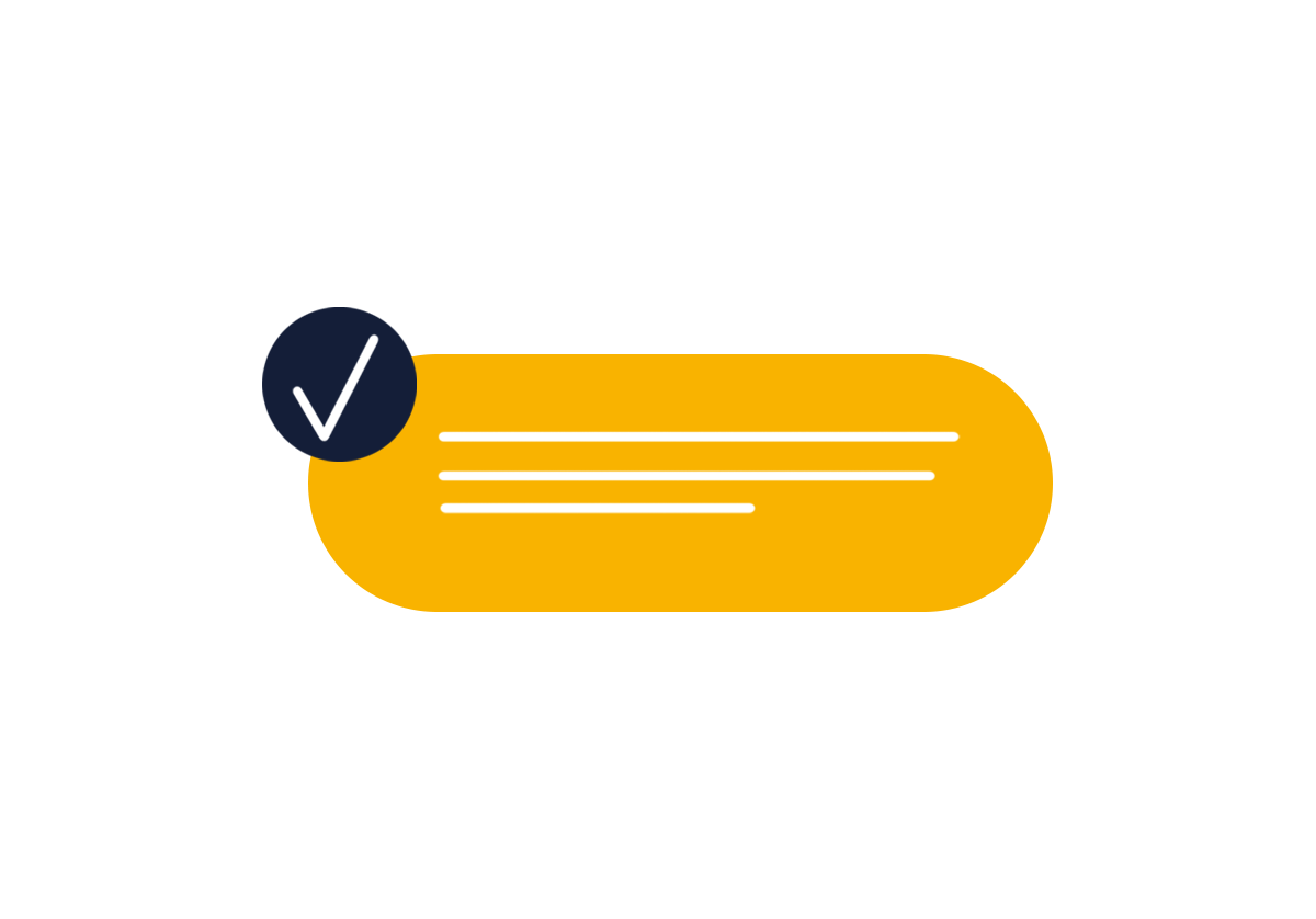
Final selection below.


BRAND EXPLORATION
I first tested out multiple character designs with the 2 color palettes I had in mind.
I eventually decided on palette 2 because the colors are poppy and strong while still creating a warm environment revolving around simple primary colors. I wanted campaigners to feel like they could breathe easy during this part of the product creation journey, and it was as easy as 1,2 3.